Python+matplotlib实现折线图的美化
1. 导入包
import pandas as pd import matplotlib.pyplot as plt import matplotlib.ticker as ticker import matplotlib.gridspec as gridspec
2. 获得数据
file_id = ' 1yM_F93NY4QkxjlKL3GzdcCQEnBiA2ltB '‘Python学习交流群:748989764 ’ url = f ' https://drive.google.com/uc?id={file_id} ' df = pd.read_csv(url, index_col= 0)
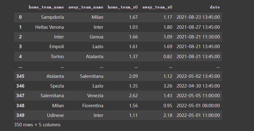
df
数据长得是这样的:
3. 对数据做一些预处理
按照需要,对数据再做一些预处理,代码及效果如下:
home_df = df.copy()

home_df = home_df.melt(id_vars = [ "  date  " ,  "  home_team_name  " ,  "  away_team_name  "  ])

home_df[  "  venue  " ] =  "  H  "  home_df.rename(columns = { "  home_team_name  " : "  team  " ,  "  away_team_name  " : "  opponent  " }, inplace = True)

home_df.replace({  "  variable  " :{ "  home_team_xG  " : "  xG_for  " ,  "  away_team_xG  " : "  xG_ag  " }}, inplace = True)
away_df = df.copy()

away_df = away_df.melt(id_vars = [ "  date  " ,  "  away_team_name  " ,  "  home_team_name  "  ])

away_df[  "  venue  " ] =  "  A  "  away_df.rename(columns = { "  away_team_name  " : "  team  " ,  "  home_team_name  " : "  opponent  " }, inplace = True)

away_df.replace({  "  variable  " :{ "  away_team_xG  " : "  xG_for  " ,  "  home_team_xG  " : "  xG_ag  " }}, inplace = True)
df = pd.concat([home_df, away_df]).reset_index(drop = True)

df 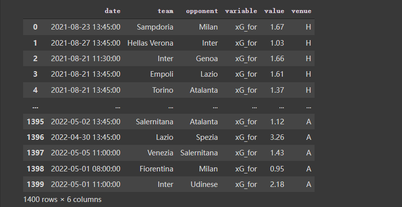
4. 画图
 #  ---- Filter the data
 Y_for = df[(df[ "  team  " ] ==  "  Lazio  " ) & (df[ "  variable  " ] ==  "  xG_for  " )][ "  value  " ].reset_index(drop = True)

Y_ag = df[(df[ "  team  " ] ==  "  Lazio  " ) & (df[ "  variable  " ] ==  "  xG_ag  " )][ "  value  " ].reset_index(drop = True)

X_ = pd.Series(range(len(Y_for)))  #  ---- Compute rolling average
 Y_for = Y_for.rolling(window = 5, min_periods = 0).mean()  #  min_periods is for partial avg.
Y_ag = Y_ag.rolling(window = 5, min_periods = 0).mean()
fig, ax = plt.subplots(figsize = (7,3), dpi = 200 )


ax.plot(X_, Y_for)

ax.plot(X_, Y_ag) 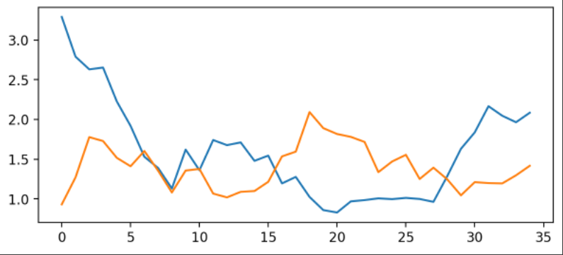
使用matplotlib倒是可以快速把图画好了,但是太丑了。接下来进行优化。
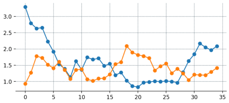
4.1 优化:添加点
这里为每一个数据添加点
fig, ax = plt.subplots(figsize = (7,3), dpi = 200 )  #  --- Remove spines and add gridlines
 ax.spines[  "  left  "  ].set_visible(False)

ax.spines[  "  top  "  ].set_visible(False)

ax.spines[  "  right  "  ].set_visible(False)


ax.grid(ls =  "  --  " , lw = 0.5, color =  "  #4E616C  "  )  #  --- The data
 ax.plot(X_, Y_for, marker =  "  o  "  )

ax.plot(X_, Y_ag, marker =  "  o  " )
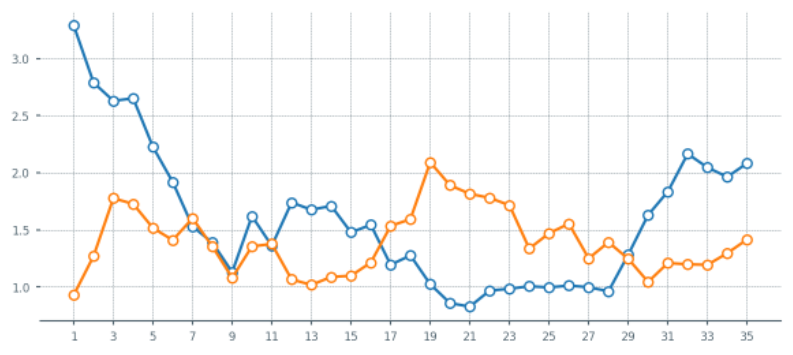
4.2 优化:设置刻度
fig, ax = plt.subplots(figsize = (7,3), dpi = 200 )  #  --- Remove spines and add gridlines
 ax.spines[  "  left  "  ].set_visible(False)

ax.spines[  "  top  "  ].set_visible(False)

ax.spines[  "  right  "  ].set_visible(False)


ax.grid(ls =  "  --  " , lw = 0.25, color =  "  #4E616C  "  )  #  --- The data
 ax.plot(X_, Y_for, marker =  "  o  " , mfc =  "  white  " , ms = 5 )

ax.plot(X_, Y_ag, marker =  "  o  " , mfc =  "  white  " , ms = 5 )  #  --- Adjust tickers and spine to match the style of our grid
 ax.xaxis.set_major_locator(ticker.MultipleLocator( 2))  #  ticker every 2 matchdays
xticks_ = ax.xaxis.set_ticklabels([x - 1  for  x  in  range(0, len(X_) + 3, 2 )])  #  This last line outputs  #  [-1, 1, 3, 5, 7, 9, 11, 13, 15, 17, 19, 21, 23, 25, 27, 29, 31, 33, 35]  #  and we mark the tickers every two positions.
 ax.xaxis.set_tick_params(length = 2, color =  "  #4E616C  " , labelcolor =  "  #4E616C  " , labelsize = 6 )

ax.yaxis.set_tick_params(length = 2, color =  "  #4E616C  " , labelcolor =  "  #4E616C  " , labelsize = 6 )


ax.spines[  "  bottom  " ].set_edgecolor( "  #4E616C  " )
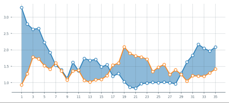
4.3 优化:设置填充
fig, ax = plt.subplots(figsize = (7,3), dpi = 200 ) Python学习交流群:748989764
  #  --- Remove spines and add gridlines
 ax.spines[  "  left  "  ].set_visible(False)

ax.spines[  "  top  "  ].set_visible(False)

ax.spines[  "  right  "  ].set_visible(False)


ax.grid(ls =  "  --  " , lw = 0.25, color =  "  #4E616C  "  )  #  --- The data
 ax.plot(X_, Y_for, marker =  "  o  " , mfc =  "  white  " , ms = 5 )

ax.plot(X_, Y_ag, marker =  "  o  " , mfc =  "  white  " , ms = 5 )  #  --- Fill between
 ax.fill_between(x = X_, y1 = Y_for, y2 = Y_ag, alpha = 0.5 )  #  --- Adjust tickers and spine to match the style of our grid
 ax.xaxis.set_major_locator(ticker.MultipleLocator( 2))  #  ticker every 2 matchdays
xticks_ = ax.xaxis.set_ticklabels([x - 1  for  x  in  range(0, len(X_) + 3, 2 )])


ax.xaxis.set_tick_params(length = 2, color =  "  #4E616C  " , labelcolor =  "  #4E616C  " , labelsize = 6 )

ax.yaxis.set_tick_params(length = 2, color =  "  #4E616C  " , labelcolor =  "  #4E616C  " , labelsize = 6 )


ax.spines[  "  bottom  " ].set_edgecolor( "  #4E616C  " )
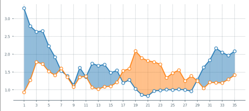
4.4 优化:设置填充颜色
1.当橙色线更高时,希望填充为橙色。但是上面的还无法满足,这里再优化一下.
fig, ax = plt.subplots(figsize = (7,3), dpi = 200 )  #  --- Remove spines and add gridlines
 ax.spines[  "  left  "  ].set_visible(False)

ax.spines[  "  top  "  ].set_visible(False)

ax.spines[  "  right  "  ].set_visible(False)


ax.grid(ls =  "  --  " , lw = 0.25, color =  "  #4E616C  "  )  #  --- The data
 ax.plot(X_, Y_for, marker =  "  o  " , mfc =  "  white  " , ms = 5 )

ax.plot(X_, Y_ag, marker =  "  o  " , mfc =  "  white  " , ms = 5 )  #  --- Fill between

 #  Identify points where Y_for > Y_ag
 pos_for = (Y_for > Y_ag)

ax.fill_between(x = X_[pos_for], y1 = Y_for[pos_for], y2 = Y_ag[pos_for], alpha = 0.5 )


pos_ag = (Y_for <= Y_ag)

ax.fill_between(x = X_[pos_ag], y1 = Y_for[pos_ag], y2 = Y_ag[pos_ag], alpha = 0.5 )  #  --- Adjust tickers and spine to match the style of our grid
 ax.xaxis.set_major_locator(ticker.MultipleLocator( 2))  #  ticker every 2 matchdays
xticks_ = ax.xaxis.set_ticklabels([x - 1  for  x  in  range(0, len(X_) + 3, 2 )])


ax.xaxis.set_tick_params(length = 2, color =  "  #4E616C  " , labelcolor =  "  #4E616C  " , labelsize = 6 )

ax.yaxis.set_tick_params(length = 2, color =  "  #4E616C  " , labelcolor =  "  #4E616C  " , labelsize = 6 )


ax.spines[  "  bottom  " ].set_edgecolor( "  #4E616C  " )
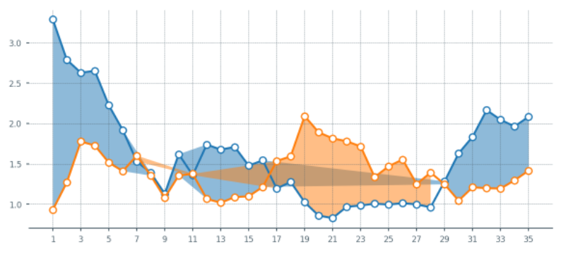
上面的图出现异常,再修改一下:
X_aux = X_.copy()

X_aux.index = X_aux.index * 10  #  9 aux points in between each match
last_idx = X_aux.index[-1] + 1 X_aux = X_aux.reindex(range(last_idx))

X_aux = X_aux.interpolate()  #  --- Aux series for the xG created (Y_for)
Y_for_aux = Y_for.copy()

Y_for_aux.index = Y_for_aux.index * 10 last_idx = Y_for_aux.index[-1] + 1 Y_for_aux = Y_for_aux.reindex(range(last_idx))

Y_for_aux = Y_for_aux.interpolate()  #  --- Aux series for the xG conceded (Y_ag)
Y_ag_aux = Y_ag.copy()

Y_ag_aux.index = Y_ag_aux.index * 10 last_idx = Y_ag_aux.index[-1] + 1 Y_ag_aux = Y_ag_aux.reindex(range(last_idx))

Y_ag_aux = Y_ag_aux.interpolate()


fig, ax = plt.subplots(figsize = (7,3), dpi = 200 )  #  --- Remove spines and add gridlines
 ax.spines[  "  left  "  ].set_visible(False)

ax.spines[  "  top  "  ].set_visible(False)

ax.spines[  "  right  "  ].set_visible(False)


ax.grid(ls =  "  --  " , lw = 0.25, color =  "  #4E616C  "  )  #  --- The data
 for_ = ax.plot(X_, Y_for, marker =  "  o  " , mfc =  "  white  " , ms = 5 )

ag_ = ax.plot(X_, Y_ag, marker =  "  o  " , mfc =  "  white  " , ms = 5 )  #  --- Fill between

 for  index  in  range(len(X_aux) - 1 ):  #  Choose color based on which line's on top
     if  Y_for_aux.iloc[index + 1] > Y_ag_aux.iloc[index + 1 ]:

        color = for_[0].get_color()  else  :

        color = ag_[0].get_color()  #  Fill between the current point and the next point in pur extended series.
    ax.fill_between([X_aux[index], X_aux[index+1 ]],

                    [Y_for_aux.iloc[index], Y_for_aux.iloc[index +1 ]],

                    [Y_ag_aux.iloc[index], Y_ag_aux.iloc[index +1 ]],

                    color =color, zorder = 2, alpha = 0.2, ec = None)  #  --- Adjust tickers and spine to match the style of our grid
 ax.xaxis.set_major_locator(ticker.MultipleLocator( 2))  #  ticker every 2 matchdays
xticks_ = ax.xaxis.set_ticklabels([x - 1  for  x  in  range(0, len(X_) + 3, 2 )])


ax.xaxis.set_tick_params(length = 2, color =  "  #4E616C  " , labelcolor =  "  #4E616C  " , labelsize = 6 )

ax.yaxis.set_tick_params(length = 2, color =  "  #4E616C  " , labelcolor =  "  #4E616C  " , labelsize = 6 )


ax.spines[  "  bottom  " ].set_edgecolor( "  #4E616C  " )
5. 把功能打包成函数
上面的样子都还不错啦,接下来把这些东西都打包成一个函数。方便后面直接出图。
 def  plot_xG_rolling(team, ax, window = 5, color_for =  "  blue  " , color_ag =  "  orange  " , data = df):  '''  This function creates a rolling average xG plot for a given team and rolling

  window.


  team (str): The team's name

  ax (obj): a Matplotlib axes.

  window (int): The number of periods for our rolling average.

  color_for (str): A hex color code for xG created.

  color_af (str): A hex color code for xG conceded.

  data (DataFrame): our df with the xG data.  '''

   #  -- Prepping the data
  home_df = data.copy()

  home_df = home_df.melt(id_vars = [ "  date  " ,  "  home_team_name  " ,  "  away_team_name  "  ])

  home_df[  "  venue  " ] =  "  H  "  home_df.rename(columns = { "  home_team_name  " : "  team  " ,  "  away_team_name  " : "  opponent  " }, inplace = True)

  home_df.replace({  "  variable  " :{ "  home_team_xG  " : "  xG_for  " ,  "  away_team_xG  " : "  xG_ag  " }}, inplace = True)


  away_df = data.copy()

  away_df = away_df.melt(id_vars = [ "  date  " ,  "  away_team_name  " ,  "  home_team_name  "  ])

  away_df[  "  venue  " ] =  "  A  "  away_df.rename(columns = { "  away_team_name  " : "  team  " ,  "  home_team_name  " : "  opponent  " }, inplace = True)

  away_df.replace({  "  variable  " :{ "  away_team_xG  " : "  xG_for  " ,  "  home_team_xG  " : "  xG_ag  " }}, inplace = True)


  df = pd.concat([home_df, away_df]).reset_index(drop = True)  #  ---- Filter the data
 Y_for = df[(df[ "  team  " ] == team) & (df[ "  variable  " ] ==  "  xG_for  " )][ "  value  " ].reset_index(drop = True)

  Y_ag = df[(df[ "  team  " ] == team) & (df[ "  variable  " ] ==  "  xG_ag  " )][ "  value  " ].reset_index(drop = True)

  X_ = pd.Series(range(len(Y_for)))  if  Y_for.shape[0] == 0:  raise  ValueError(f "  Team {team} is not present in the DataFrame  "  )  #  ---- Compute rolling average
 Y_for = Y_for.rolling(window = 5, min_periods = 0).mean()  #  min_periods is for partial avg.
  Y_ag = Y_ag.rolling(window = 5, min_periods = 0).mean()  #  ---- Create auxiliary series for filling between curves
 X_aux = X_.copy()

  X_aux.index = X_aux.index * 10  #  9 aux points in between each match
  last_idx = X_aux.index[-1] + 1 X_aux = X_aux.reindex(range(last_idx))

  X_aux = X_aux.interpolate()  #  --- Aux series for the xG created (Y_for)
  Y_for_aux = Y_for.copy()

  Y_for_aux.index = Y_for_aux.index * 10 last_idx = Y_for_aux.index[-1] + 1 Y_for_aux = Y_for_aux.reindex(range(last_idx))

  Y_for_aux = Y_for_aux.interpolate()  #  --- Aux series for the xG conceded (Y_ag)
  Y_ag_aux = Y_ag.copy()

  Y_ag_aux.index = Y_ag_aux.index * 10 last_idx = Y_ag_aux.index[-1] + 1 Y_ag_aux = Y_ag_aux.reindex(range(last_idx))

  Y_ag_aux = Y_ag_aux.interpolate()  #  --- Plotting our data

   #  --- Remove spines and add gridlines
 ax.spines[  "  left  "  ].set_visible(False)

  ax.spines[  "  top  "  ].set_visible(False)

  ax.spines[  "  right  "  ].set_visible(False)


  ax.grid(ls =  "  --  " , lw = 0.25, color =  "  #4E616C  "  )  #  --- The data
 for_ = ax.plot(X_, Y_for, marker =  "  o  " , mfc =  "  white  " , ms = 4, color = color_for)

  ag_ = ax.plot(X_, Y_ag, marker =  "  o  " , mfc =  "  white  " , ms = 4, color = color_ag)  #  --- Fill between

   for  index  in  range(len(X_aux) - 1 ):  #  Choose color based on which line's on top
       if  Y_for_aux.iloc[index + 1] > Y_ag_aux.iloc[index + 1 ]:

          color = for_[0].get_color()  else  :

          color = ag_[0].get_color()  #  Fill between the current point and the next point in pur extended series.
      ax.fill_between([X_aux[index], X_aux[index+1 ]],

                      [Y_for_aux.iloc[index], Y_for_aux.iloc[index +1 ]],

                      [Y_ag_aux.iloc[index], Y_ag_aux.iloc[index +1 ]],

                      color =color, zorder = 2, alpha = 0.2, ec = None)  #  --- Ensure minimum value of Y-axis is zero
 ax.set_ylim(0)  #  --- Adjust tickers and spine to match the style of our grid
 ax.xaxis.set_major_locator(ticker.MultipleLocator( 2))  #  ticker every 2 matchdays
  xticks_ = ax.xaxis.set_ticklabels([x - 1  for  x  in  range(0, len(X_) + 3, 2 )])


  ax.xaxis.set_tick_params(length = 2, color =  "  #4E616C  " , labelcolor =  "  #4E616C  " , labelsize = 6 )

  ax.yaxis.set_tick_params(length = 2, color =  "  #4E616C  " , labelcolor =  "  #4E616C  " , labelsize = 6 )


  ax.spines[  "  bottom  " ].set_edgecolor( "  #4E616C  "  )  #  --- Legend and team name
 Y_for_last = Y_for.iloc[-1 ]

  Y_ag_last = Y_ag.iloc[-1 ]  #  -- Add the team's name
  team_ = ax.text(

            x = 0, y = ax.get_ylim()[1] + ax.get_ylim()[1]/20 ,

            s = f '  {team}  '  ,

            color =  "  #4E616C  "  ,

            va =  '  center  '  ,

            ha =  '  left  '  ,

            size = 7 )  #  -- Add the xG created label
  for_label_ = ax.text(

            x = X_.iloc[-1] + 0.75, y = Y_for_last,

            s = f '  {Y_for_last:,.1f} xGF  '  ,

            color = color_for,

            va =  '  center  '  ,

            ha =  '  left  '  ,

            size = 6.5 )  #  -- Add the xG conceded label
  ag_label_ = ax.text(

            x = X_.iloc[-1] + 0.75, y = Y_ag_last,

            s = f '  {Y_ag_last:,.1f} xGA  '  ,

            color = color_ag,

            va =  '  center  '  ,

            ha =  '  left  '  ,

            size = 6.5 )
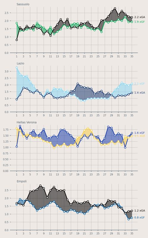
6.测试函数
file_id = ' 1yM_F93NY4QkxjlKL3GzdcCQEnBiA2ltB ' url = f ' https://drive.google.com/uc?id={file_id} ' df = pd.read_csv(url, index_col=0)
再设置更加丰富的颜色:
fig = plt.figure(figsize=(5, 8), dpi = 200, facecolor = " #EFE9E6 " )
ax1 = plt.subplot(411, facecolor = " #EFE9E6 " )
ax2 = plt.subplot(412, facecolor = " #EFE9E6 " )
ax3 = plt.subplot(413, facecolor = " #EFE9E6 " )
ax4 = plt.subplot(414, facecolor = " #EFE9E6 " )
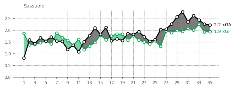
plot_xG_rolling( " Sassuolo " , ax1, color_for = " #00A752 " , color_ag = " black " , data = df)
plot_xG_rolling( " Lazio " , ax2, color_for = " #87D8F7 " , color_ag = " #15366F " , data = df)
plot_xG_rolling( " Hellas Verona " , ax3, color_for = " #153aab " , color_ag = " #fdcf41 " , data = df)
plot_xG_rolling( " Empoli " , ax4, color_for = " #00579C " , color_ag = " black " , data = df)
plt.tight_layout()